There is a lot of confusing reporting on the water footprint of food. Many visualizations suffer from design shortcomings that present a distorted view of agricultural water footprint, compromising the public’s ability to make informed choices in response to water scarcity issues.
The Los Angeles Times recently ran an interactive visualization of food water footprint on their website as part of their drought coverage. This visualization got a lot of attention, and was shared widely on social media. Despite its popularity, this visualization has several shortcomings that distort the water footprint of food.
With such a tremendous amount of water at stake, it is important to consider representations of agricultural water footprint critically. In this article, we’ll discuss shortcomings of this water footprint analysis, why these problems matter, and how professional water footprint researchers address these issues.
The Los Angeles Times visualization
The Los Angeles Times ran an interactive feature on their website, along with this summary image, as a way to explore agricultural water footprint:
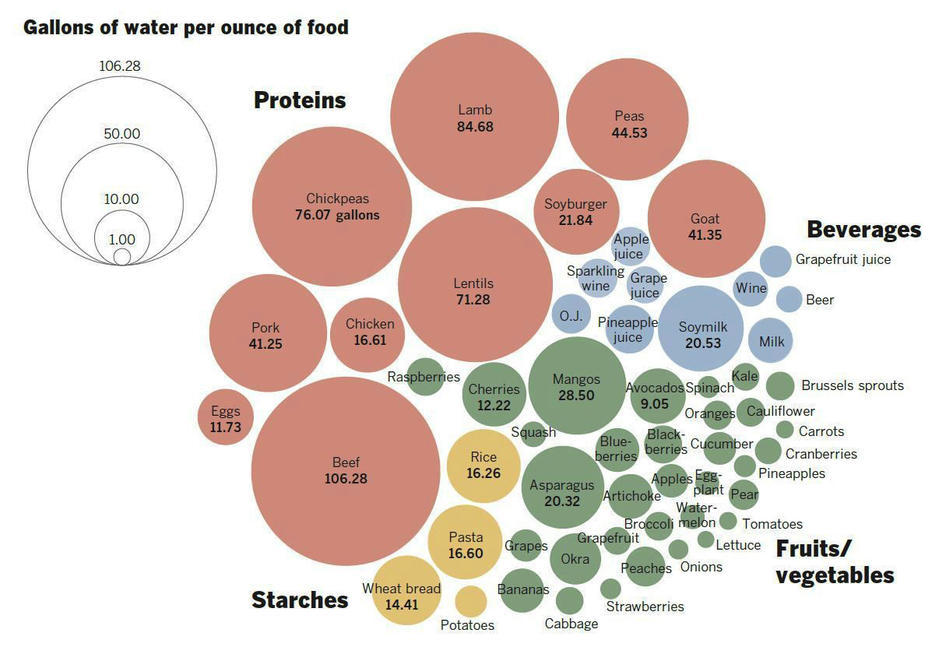
A graphic representation of food water footprints from the Los Angeles Times. (1)
It’s important to focus on agricultural water use, rather than household water use, since the vast majority of our water use is agricultural. In that sense, the Los Angeles Times has chosen an appropriate focus for their visualization.
At first glance, the graphic seems plausible. Meat is generally water-intensive, whereas fruits and vegetables are comparatively water efficient. This aligns with ecological consensus, as well as common sense — animal foods are produced by animals that consume plant foods, and this conversion is inefficient, so we’d expect animal foods to be more water intensive than the plant foods that animals are fed.
However upon closer inspection, the graphic leads the reader to some strange conclusions that might arouse our suspicion:
- Lentils here are more water-intensive than pork.
- Eggs have a lower water footprint than staple grains.
- Soy milk has a higher water footprint than dairy milk, by a factor of two or three.
We should be concerned that any animal products outperform staple grains, since farmed animals are primarily grain fed. Unless something strange is going on, this would imply a feed conversion efficiency of over 100%, violating the first law of thermodynamics.(2)
A reader encountering this visualization is likely to come away with a distorted sense of food water footprint, that differs from consensus among peer-reviewed research on the subject. In this article, we will explore some of the distortions at play in this visualization.
Comparing Wet and Dry Weights
One of the most common problems in water footprint visualizations is the choice of weight, rather than nutritional value, as the metric by which foods are compared. This is an easy mistake to make, however it confers a subtle bias that has dramatic effects on water footprint analysis.
Using weight to compare foods is especially problematic when comparing foods that are weighed dry with foods that are weighed wet. Many of the plant foods with a surprisingly high water footprint in the LA Times graphic, such as chickpeas, lentils, rice and pasta, are weighed dry. Meat and animal products are almost always weighed in their fully hydrated form.
To illustrate how this affects water efficiency analysis, consider lentils. Rehydrated lentils weigh about three times as much as dried lentils. If we measure water efficiency by water-per-weight, as the Los Angeles Times graphic does, the hydrated lentils would register as three times as efficient as dry lentils by this metric.
Since adding water to dry lentils does not create more food, so the fact that our water efficiency metric measures wet lentils as so much more water efficient is a weakness in our metric. The fact that this metric is so easily manipulated should lead us to think critically about our choice of units, and question whether weight is the best measure of food value.
A more useful approach would be to measure food by calories. If we compute water efficiency as the amount of water needed to produce a calorie of food, many anomalous results in the visualization disappear:
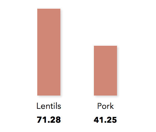
Lentil and pork water footprint measured in gallons per oz, as represented by the LA Times.
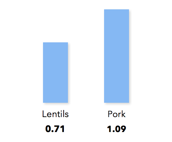
Lentil and pork water footprint, in gallons per calorie.
Using weight to compare the water efficiency of these foods, rather than nutritional value, biases this visualization in favor of heavier, wet-shipping animal foods, and against dry-shipping foods such as chickpeas and lentils.
Unreasonable Comparisons
If the graph is useful to the reader (or “actionable”, as we say in business analytics), it is because choosing foods with lower water footprints would have an effect of conserving water. Comparing water efficiency in this way suggests that equal-weight portions of food represent a reasonable consumer choice.
To explore this, let’s consider lettuce, a more efficient food on this graph, and lentils, a less efficient food on this graph. One kg of lettuce is about 150 calories. One kg of (dehydrated) lentils is 3530 calories. This does not represent a reasonable consumer choice — substituting 1 kg of lentils for 1 kg of lettuce increases the calorie content by a factor of 23, a difference of almost two full days of food for an adult.
This graphic invites this type of unreasonable comparison between vastly different amounts of food. This is a shortcoming of its design, and undermines its ability to guide readers to useful decisions about water efficiency.
Uncritical Analysis
The Los Angeles Times’ interactive feature suggests that the producers of this analysis are not aware that the water footprints they give for pulses correspond to dry pulses.
The water efficiency figures they present are consistent with dried legumes (3). However when they visualize portions of food, they picture a reasonable serving of rehydrated prepared legumes.
Consider their visualization of chickpeas, at the default portion size:
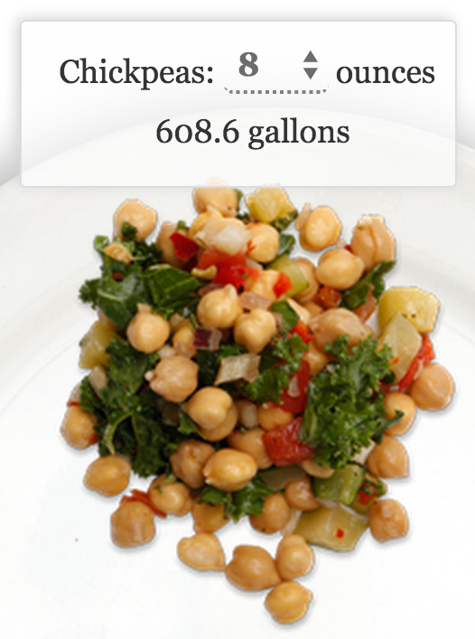
This water footprint figure corresponds to 8 oz (226 grams) of dry chickpeas. That’s 822 calories, or about 3 cups of chickpeas. The image appears to represent at most a cup of chickpeas. For comparison — a cup of chickpeas has a more modest footprint of 203 gallons.
It is disappointing that the authors of the Los Angeles Times visualization do not appear to have understood which of the water footprints they were working with represented dry weights, and how this affected the water footprint values they were presenting. This is especially unfortunate given that the papers they are citing gave the researchers’ interpretation of the data, and made a clear case for the nutritional water efficiency of plant foods. The fact that the figures they had taken from these papers painted a different picture should have invited skepticism.
Soy Milk
A related point of confusion in this visualization is soy milk. According to the Los Angeles Times, soy milk’s water footprint is 2-3 times that of dairy milk. This is a surprising conclusion, since we expect animal foods to be less efficient than the grains and soy that food animals are fed. This conclusion also contradicts research on the topic, including a paper coauthored by Arjen Hoekstra, one of the authors of the paper that the Los Angeles Times is citing (5).
The explanation for this again comes down to confusion involving water weight. The water footprint given in Mekonnen & Hoekstra 2010 (4) is for the soy component of soy milk, rather than soy milk itself. Since soy milk is composed of 10% soy solids and 90% water, the actual water footprint of soy milk is an order of magnitude smaller.
A detailed analysis of the water footprint of soy milk in comparison to dairy milk can be found in Ercin 2012 (5). In it, they find that the water footprint of soy milk is less than a third that of dairy milk.
The fact that Mekonnen & Hoekstra 2010 gives a water footprint of soy milk solids, rather than soy milk itself, is an easy mistake to make, and I can understand the Los Angeles Times making this error. However I think that a critical consideration of this data would have revealed that the conclusion their visualization suggests disagrees with that of the authors whose work they are citing. This should have invited some skepticism about their interpretation of these numbers.
Update: The Los Angeles Times has issued a correction to their interactive feature acknowledging their erroneous figure for soy milk water footprint, and giving a correct figure.
Chickpeas and Lentils
The most water-intensive plant foods in the Los Angeles Times visualization are chickpeas and lentils. The visualization suggests that these are the most water-intensive foods after only beef and lamb. Even when analyzed as water per calorie, the water footprint for US chickpeas is high — only moderately more efficient than pork. This might lead one to wonder why more attention is not paid to the water footprint of pulses, rather than animal foods. This merits some examination.
The relative water inefficiency for chickpeas and lentils is specific to the US, and global water footprint analyses for these crops shows them to be water efficient. US chickpea water consumption is dominated by grey water footprint (82% of the total footprint), which corresponds to pollution and water contamination (4). At this time I have not looked into why US chickpea farming would have a greater pollution burden than the global average, but this is not an inherent inefficiency. Chickpeas may be a commodity, like rice, that can be grown more efficiently in some climates than others. If so, then importing chickpeas, rather than producing them domestically, may be a wiser use of the world’s freshwater resources.
However highlighting chickpeas and lentils’ water footprint as prominently as the Los Angeles Times visualization does is inappropriate given the scale of US production of these crops. These crops occupy a trivial amount of US farmland, and account for a negligible amount of agricultural water use.
Chickpeas occupy some 215,100 acres in the US, comprising less than 0.07% of total US farmland. Only 4% of chickpea farmland is in California, accounting for 0.26% of Californian cropland (6). Compare this with the 46% of Californian cropland used to grow hay and other forage, or the 12% used to grow corn for silage, both used exclusively for food animals (6).
Lentils make up a similarly small fraction of US farmland — less than 0.09% — however unlike chickpeas, the USDA / NASS 2014 Crop Production Summary does not record any lentil production at all in California, making lentils an even less appropriate focus for water footprint analysis accompanying articles on California’s drought (6).
Chickpeas and lentils are also an inappropriate focus at a national level, as the US allocates less than 0.1% of farmland to these crops, while allocating 18% of farmland to hay and 27% of farmland to soy (used primarily for animal feed), for instance. (6)
The summary accompanying the Los Angeles Times visualization reads:
So what are some thirsty foods? Beef, pork, lamb, chickpeas, lentils, peas, goat, mangoes and asparagus.
The prominent placement of chickpeas and lentils in the list of water-intensive foods leaves the reader with the impression that these foods contribute meaningfully to agricultural water use in either the US or in California. By placing unwarranted emphasis on chickpeas and lentils, the Los Angeles Times compromises the ability of its readership to make prudent dietary choices.
How the professionals do it
Measure food by nutritional value
The problems above mostly derive from using food weight to measure water efficiency. These problems have a simple solution — measuring food by nutritional content, rather than by weight. Water efficiency then becomes a measure of “nutritional value per drop” as Hoekstra suggests (7, 8), measured in calories per unit water (or alternatively protein per unit water).
Water content of foods becomes irrelevant, and our measurements are not biased toward wet or dry foods. Graphs of water-per-calorie set up comparisons that are relevant to real-world choices between equicaloric portions of food.
If we use a water-per-calorie approach, meat’s water footprint grows, vegetable proteins like beans and lentils’ footprints are reduced, staple grains have the lowest water footprint (with potatoes lowest of all), and fruits and vegetables are in between. This is how professional ecologists represent their water footprint data.
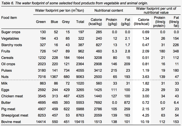
Water footprint data, as summarized by Mekonnen and Hoekstra, whose work the LA Times is representing. Emphasis mine. (4)
This is the form of water footprint data that is most relevant to the dietary choices we face. Water footprint data in this form bring clarity to ecologists’ claims that animal foods are uniquely water inefficient.
Note that it was not necessary to mine the literature to find this graph. This graph comes from the very paper that the Los Angeles Times visualization is citing.
Here is my own attempt at visualizing similar data, from a post on California’s water restrictions:
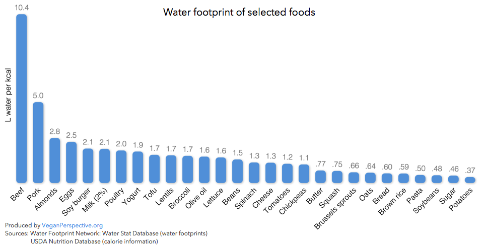
This graph communicates more effectively why ecologists advocate reducing animal products as a way to reduce water footprint. It is also a more useful graph, since the comparisons it implies are reasonable, and the substitutions a reader might consider in response are fair, in that they are calorie-adjusted.
Make reasonable comparisons
Arjen Hoekstra, one of the authors of the water footprint papers that the Los Angeles Times visualization cites, also coauthored a paper that discusses replacing animal foods with vegan foods directly. Ercin and Hoekstra choose two common vegan alternative foods, and compare them directly with animal foods that they are most likely to replace. They compare dairy milk with soy milk, and a veggie burger with a conventional burger.
When compared in a straightforward way against reasonably analogous foods (in terms of nutritional and culinary role, and with comparable portions), the results are very clear — plant foods are a much more efficient use of resources, and water in particular, than the animal foods they are likely to replace. Soy burgers use less water than conventional burgers by a factor of ten, and soy milk uses less water than dairy milk by a factor of three (5).
Critically examining distortion
The shortcomings of the Los Angeles Times analysis are understandable, and are likely to arise from naive design and incomplete understanding, rather than willful distortion. However their willingness to accept results that should have been surprising may best be explained by bias.
For instance, when the Los Angeles Times came across data that seemed to suggest that soy milk had three times the water footprint of dairy milk, they published it. When A Vegan Perspective came across the same data, we contacted the authors to ask why this figure differs so substantially from one of the author’s other papers comparing soy and dairy specifically. (The authors were very helpful, and explained that the Mekonnen & Hoekstra figure was for the dry soy component of soy milk, rather than for fully constituted soy milk.)
Why would these responses be different? It’s possible that I have spent more time with water footprint data than had the authors of the Los Angeles Times visualization. However I find this to be an inadequate explanation. As journalists, the Los Angeles Times had the ability to contact experts, including the study’s authors.
I think the difference is more likely to be explained by bias. Comparing dry plant foods with wet animal foods may go unchallenged because it privileges animal foods, which most people are motivated to justify continuing to eat. Similarly, typical omnivores consume more dairy than soy milk, and might not be motivated to challenge distortions that privilege their consumption patterns.
One might counter that my own vegan bias explains the difference in response. This essentially saying the same thing. There is not a neutral and a biased position here; there are two different biases at play. This difference of perspective is important to consider given that one of these positions dominates the public conversation, supported by 97% of the population.
The willingness of journalists and the public to accept surprising results in favor of animal food, contrary to the researchers’ own interpretations of their data, may be best explained by bias.
Conclusion
We should pay attention to how researchers interpret their own data before performing our own analysis. With that in mind, let’s consider Arjen Hoekstra’s editorial on water footprint and animal foods in Environmental Research Letters:
We know from land, energy and climate studies that the livestock sector plays a substantial role in deforestation, biodiversity loss and climate change. More recently it has become clear that livestock also significantly contributes to humanity’s water footprint, water pollution and water scarcity. Jalava et al (Environ. Res. Lett.) show that considerable water savings can be achieved by reducing the fraction of animal products in our diet. The findings are in line with a few earlier studies on water use in relation to diets. As yet, this insight has not been taken forward in national water policies, which focus on ‘sustainable production’ rather than ‘sustainable consumption’. Most studies and practical efforts focus on increasing water-use efficiency in crop production (more crop per drop) and feed conversion efficiency in the livestock sector (more meat with less feed). Water use efficiency in the food system as a whole (more nutritional value per drop) remains a blind spot. (7)
Incremental improvements in production efficiency is unlikely to overcome the 20x difference in water footprint between staple grains and beef. Rather than hoping that a technological breakthrough will solve our ecological problems, we should choose a diet that can reduce our water footprint with current technology, and focus our research on improving the efficiency of plant foods.
I believe that a cultural bias favoring animal foods best explains our reluctance to embrace this research and to allow science to guide water conservation policy.
Related reading
- Arjen Hoekstra has two excellent editorials on this topic:
- A New York Times editorial written for a general audience.
- An editorial in Environmental Research Letters written for a research audience.
Notes & References
- Kim, Kyle. “From steak to mangoes, here are some water-hogging foods.” Los Angeles Times, Local / L.A. Now. (Downloaded April 2015.)
- This logic is valid here, however to make this argument rigorously, one would have to eliminate the possibility that layer hens could be fed human-inedible crops that are more water efficient than crops humans can eat. In practice, layer hen diets are composed primarily of human edible grains. Here’s a token reference for this.
While alfalfa comprises 4% of feed in this reference, this is not enough to substantially increase feed efficiency even if alfalfa was a water efficient crop, which it is not. Foods that humans do not eat such as cottonseed meal may replace soybean meal, but soybean meal is preferred. Cotton, like alfalfa, is a water-intensive crop. - For instance, the visualization gives a footprint of 76.07 gallons per oz of chickpeas. Mekonnen & Hoekstra 2010 (citation below) gives a blue and grey water footprint for US chickpeas of 1818 L / kg and 8339 L / kg respectively, which converts to 76.07 gallons per oz. These values correspond to HS product code 071320, defined as: “Chickpeas, dried, shelled, whether or not skinned or split”.(4)
- Mekonnen, M.M. and Hoekstra, A.Y. The green, blue and grey water footprint of crops and derived crop products, Value of Water Research Report Series No. 47, UNESCO-IHE, Delft, the Netherlands. (2010)
Referred to here as Mekonnen & Hoekstra 2010. - Ercin et al. “The water footprint of soy milk and soy burger and equivalent animal products.” Ecological Indicators (2011)
- National Agricultural Statistics Serivice. Crop Production 2014 Summary. (2014)
- Hoekstra, Arjen Y. Water for animal products: a blind spot in water policy. Environ. Res. Lett. (2014)
- Hoekstra, Arjen Y. “To Save Water, Change Your Diet.” New York Times. (June 29, 2014)